Meroë Morse and Polaroid’s Culture of Art and Innovation at the Harvard Business School
Our team recently completed the catalog for the Harvard Business School exhibition 𝘍𝘳𝘰𝘮 𝘊𝘰𝘯𝘤𝘦𝘱𝘵 𝘵𝘰 𝘗𝘳𝘰𝘥𝘶𝘤𝘵: 𝘔𝘦𝘳𝘰𝘦 𝘔𝘰𝘳𝘴𝘦 𝘢𝘯𝘥 𝘗𝘰𝘭𝘢𝘳𝘰𝘪𝘥’𝘴 𝘊𝘶𝘭𝘵𝘶𝘳𝘦 𝘰𝘧 𝘈𝘳𝘵 𝘢𝘯𝘥 𝘐𝘯𝘯𝘰𝘷𝘢𝘵𝘪𝘰𝘯.
Meroë Morse became a key contributor to the development of instant photography and served as the liaison between scientists and the photographers who consulted for Polaroid. She joined Polaroid in 1945 after graduating from Smith College, having studied art history with Clarence Kennedy, a friend and associate of Edwin Land.
Morse brought both scientific and artistic sensibilities to the advancement of a photographic medium that would come to have unique cultural and artistic significance. She built relationships with fine art photographer Minor White, color art photography pioneer Marie Cosindas, and landscape photographer Ansel Adams.
A Look Back at Some Great Projects in 2023
Rebranding the Museum of Russian Icons and website redesign
Catalog design for the Bowdoin College Museum of Art
Catalog design for the Bowdoin College Museum of Art
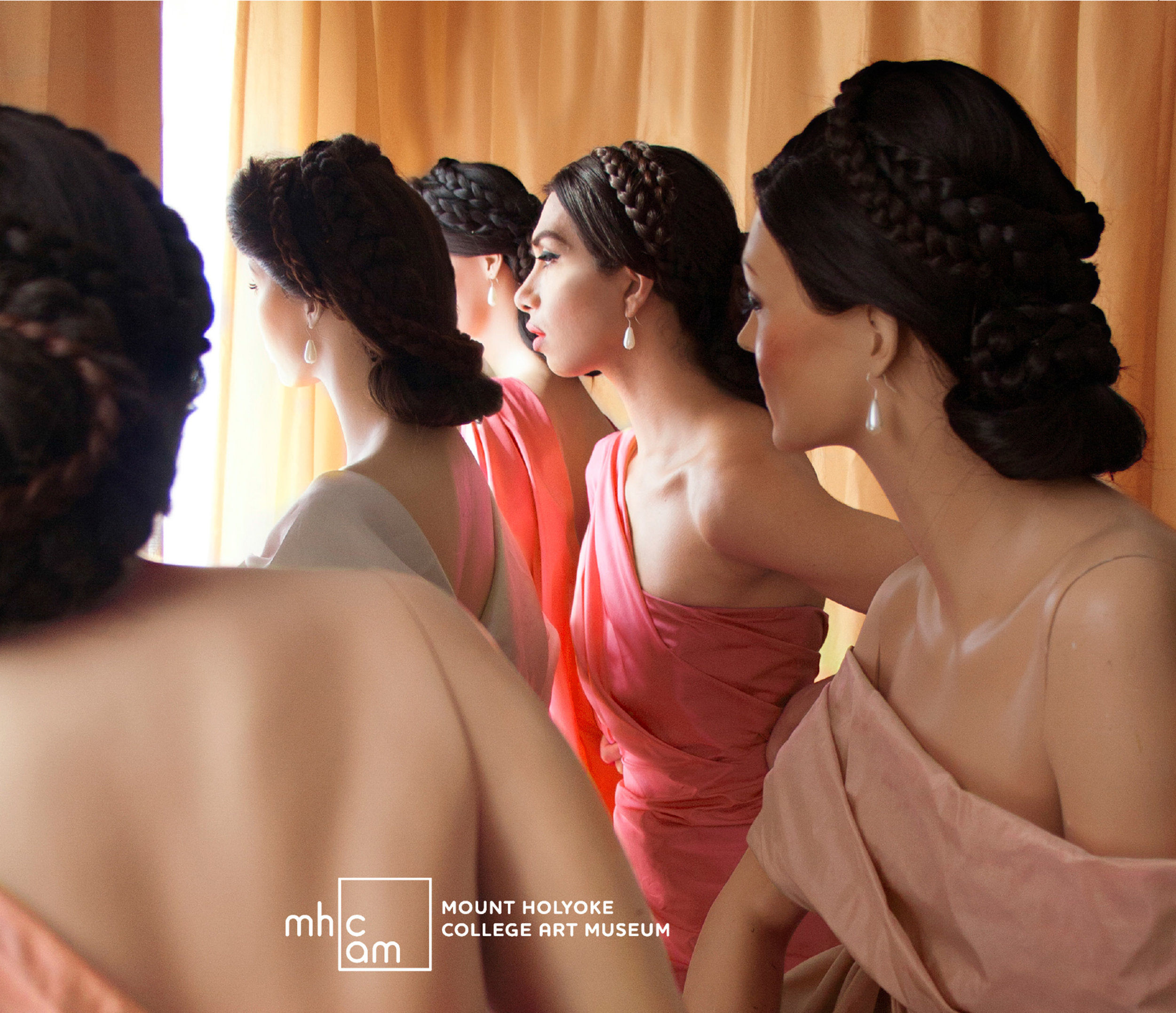
Catalog design for Mt Holyoke College Art Museum
Website design for The Maxine
Design of issue 57 for Log
Catalog design for the Fuller Craft Museum
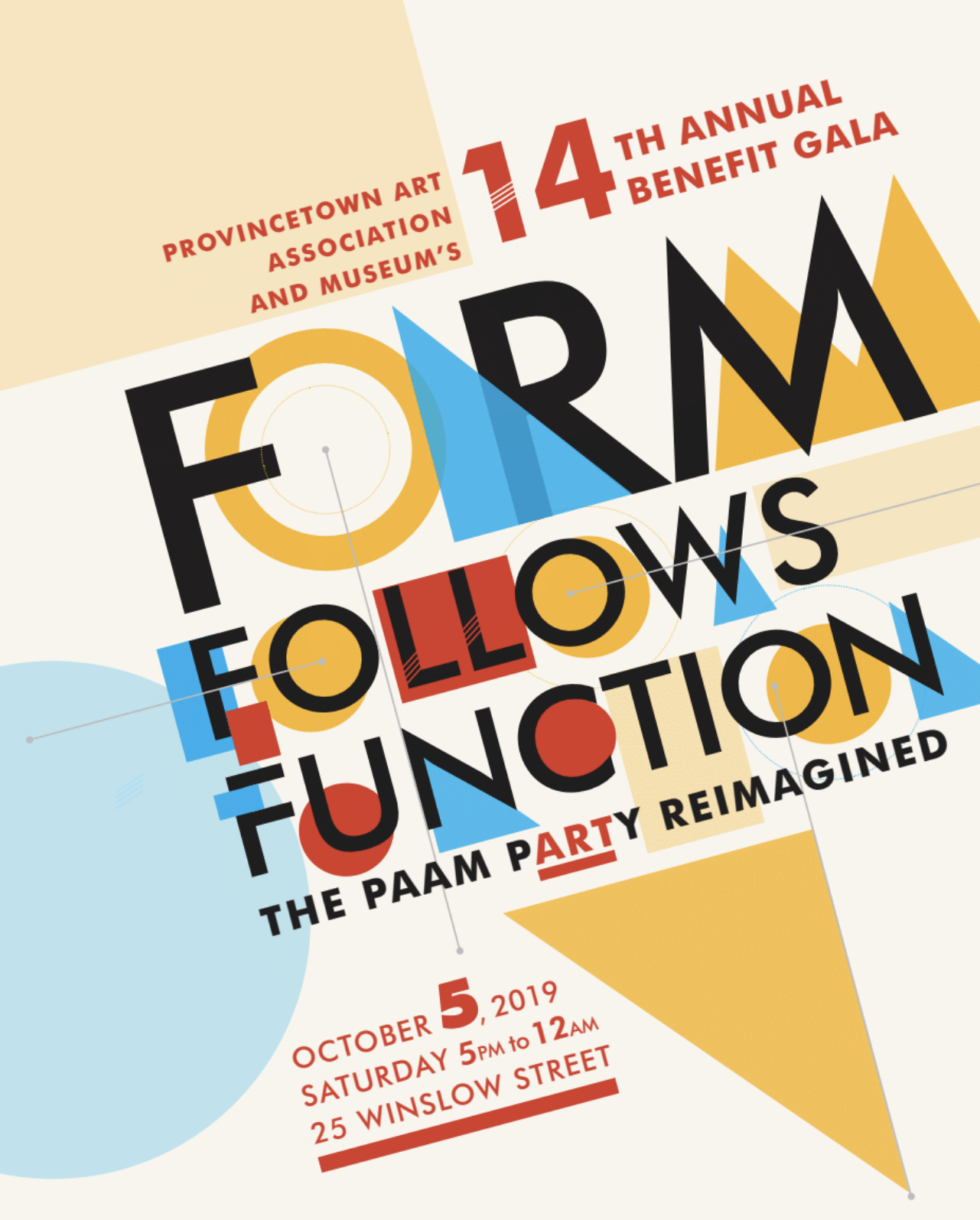
Catalog design for the Provincetown Art Association and Museum
REBRANDING THE MUSEUM OF RUSSIAN ICONS
Wilcox Design was engaged by the Museum of Russian Icons in Clinton, Massachusetts, to develop a new brand, including a new name to reflect its evolution from a passion project of its founder to present his expansive collection of Russian Icons to an international locus for the exhibition, collection, and study of Eastern Christian art.
Growing out of a recent strategic planning process, the rebrand needed to emphasize a revitalized mission to balance exhibition and scholarship, while reflecting the expansion of its collection to include sacred icons from the full range of Eastern Christian cultures. The new name, mission, and graphic identity were unveiled at a “Big Reveal” event on October 14 to celebrate the museum’s 25th anniversary.
A New Name and Tagline
The Wilcox Design team, including strategist Kim Carlin, conducted extensive interviews with the organization’s staff and volunteers, leadership, and community members. Sharing our findings, we led a core brand committee of Board members and museum leadership through an exploration of naming options, landing on The Icon Museum and Study Center, and a tagline: Illuminating the art of the sacred icon. Explains Jean Wilcox, principal of Wilcox Design:
“The name emerged from a very collaborative process. It is both an accurate reflection of who they are, and a bold statement of the leadership role they are claiming as the only organization entirely devoted to the collection, exhibition, and study of Eastern Christian art in the U.S.”
From: Museum of Russian Icons / Center for Icon Studies
To: The Icon Museum and Study Center
Renaming Encompasses the Full Mission and Vision
• Puts “The Icon” first
• Asserts leadership and uniqueness with “The”
• Includes key words from existing names—builds on the existing foundation and doesn’t reinvent the wheel
• Forefronts “Museum”—respects and honors the historic role as a destination/economic driver in Clinton
• Raises visibility of icon studies—signals an expanded role beyond Clinton
• Removes “Russian”—allows continuation of current focus but also room for growth and new directions
• Modern and simple—signals a forward-looking mission and vision
Visual Rebrand
The visual rebranding grew out of a deep dive into the “iconography” and structure of sacred icons, identifying several key elements to consider in developing a new logo: their symmetry and framing/placement of images, and the circle as a metaphor and as expressed through the ubiquitous halo.
The new logo features a typographic rendering of the halo which is a key feature of all icons. The negative space indicates a head and shoulders.
The golden color is a bright, warm, illuminating tone that connects to the gold leaf embellishment featured on icons.
Website
The updated web structure brings the Study Center into balance with the Museum. New landing page content brought to life our messaging recommendations, which highlighted three key themes for all messaging—icons are our focus, icons are important, we are a unique destination—and identified key messages by target audience.
The client’s goal was to create a visually stunning, image-rich experience not only to encourage in-person visitation, but to make the website a destination in its own right.
The homepage is a dynamic entry point for visitors, offering an at-a-glance view of current offerings and an easily absorbable description of the IM+SC mission and focus.
The collection landing page allows users to browse the museum’s collection and sort images by cultural origin.
In keeping with the IM+SC mission of “illuminating the art of the sacred icon,” we collaborated with the museum team to develop a unique visual resource for those unfamiliar with icons.
Project team
Project director and designer: Jean Wilcox
Writer and content strategist: Kim Carlin
Web developer: Douglas Green
Photographer: Andrew Ryan
Banner photo by Andy Ryan
Hear Me Now with Simone Leigh
It is gratifying to see the exhibition Hear Me Now: The Black Potters of Old Edgefield, South Carolina come to the MFA Boston after its celebrated run at the Metropolitan Museum of Art. Having designed the exhibition catalog, I am thrilled to see this exhibition travel to different museum venues, and to see the unique expression of this content in each venue. The majority of the work in this exhibition is unattributed—the potters were enslaved laborers. One known master artisan whose work features prominently in the exhibition is a potter named Dave, who scratched his thoughts and poems onto the surface of many of his vessels. An exhibition design element I felt was particularly effective at the MFA Boston exhibition was their mesmerizing adaption of Dave’s handwriting within the gallery. Above the exhibition space his scripts are projected on to a screen, bringing his words and thoughts to life above his works, adding a spirited presence to the room. On one storage jar, dated 1857, Dave expresses his role as creator, potter, and poet with the statement, I made this jar for cash though its called lucre trash.
Another artist in the exhibition, whose work is strongly influenced by Dave's and explores similar issues of the value of the object and its creator is the contemporary artist Simone Leigh. Currently Boston is privileged with 2 exhibitions featuring Simone Leigh’s work. The ICA Boston’s current solo show of her work includes many of her works which were featured in the 59th Venice Biennale show of 2022. Two of her large scale Jugs are on display in the ICA’s exhibition. On these pieces, the surface motif resembles cowrie shells, historically one of the world’s oldest forms of currency. In a 2020 ARTnews interview Leigh stated, “I would describe the cowrie shell as a stand-in for the female body, or a body in general, or a representation of an absence as well as a presence.”
Top row: Hear Me Now exhibition at the Metropolitan Museum of Art;, left, and at the MFA, Boston, right; Middle row: handwriting by Dave the potter at the MFA, Boston; Bottom row: Hear Me Now exhibition catalog; Simone Leigh, Jug series, Metropolitan Museum of Art and at the ICA, Boston
A look Back at 2022 Projects
Here are some of our favorite projects of 2022, in print and interactive design.
Exhibition catalog design for the Guggenheim Museum Bilbao
Exhibition catalog design for the Metropolitan Museum of Art
Interactive Playscape design and signage
Annual Report for the Mount Holyoke College Art Museum
Exhibition brochure that also functions as a hat for the Springfield Museums
Website design for the Harvard Business School
Brochure design for the Bowdoin College Museum of Art
Book design on the work of artist Daniel Jocz
Catalog design for the Metropolitan Museum of Art
Poster and postcard design for the Harvard Business School
Extending a Museum’s Brand into an Interactive PLAYscape
The new brand identity Wilcox Design developed for Fitchburg Art Museum in 2018 forefronted the museum’s welcoming acronym. A key goal was to create a new visual look that reflected the museum has been doing for more than a decade to welcome every member of the Fitchburg community. The branding needed to broadcast the museum’s culture of openness and sense of FAMily while boldly asserting its mission to bring groundbreaking, high-quality art to its community.
Wilcox Design’s most recent project with FAM had that same dual focus—with a particular emphasis on the museum’s core value of inviting community members to explore art, interact with artists, and unlock their own creativity.
Creating a Creative Learning Space for Children
Since fall 2021, FAM has collaborated with the Fitchburg Public Schools (FPS) in an after-school learning program held in its adjacent studio space, The Art Place on Elm. For FAM, this program is core to its mission “as a catalyst for learning, creativity, and community building.”
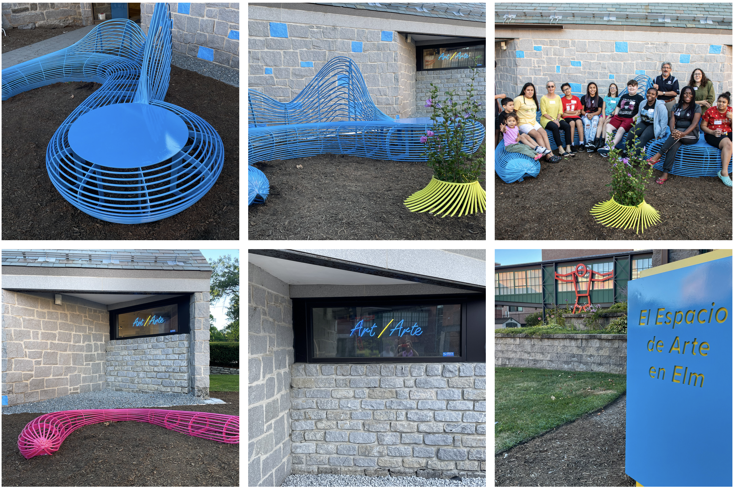
Wilcox Design developed wayfinding and signage to support an exciting new artist-in-the-community initiative for participants in the afterschool arts program at FAM. The new signage continued the museum’s commitment to bilingual wayfinding in both English and Spanish as part of its holistic approach to welcoming and engaging the entire Fitchburg community.
Children in the FPS/FAM afterschool arts program engaged with New England sculptor Roberley Bell, providing input that shaped her design of PLAYscape, a new interactive sculptural installation for The Art Place on Elm. Bell’s site-specific public projects are inspired by nature and blur the lines between inside and outside with organic forms and brilliant color and patterning.
Wilcox Design consulted with FAM and Bell in the design of the PLAYscape sculptural seating and designed a new neon art piece for the studio window to mirror the color palette and contours of the Bell sculptures.
Bell embraced the experience of working in collaboration with children on this project: “As an artist working in the public realm, I try to engage the stakeholders…[and children] are the long term stakeholder of a project in their neighborhood.” Children provided drawings and clay models that contributed to the final piece, creating “a shared, playful space accommodating seating for everyone.”
Bringing a Space to Life
Bell’s sculpture, installed September 1, 2022, along with new landscaping and signage, transformed a quiet cul-de-sac on the FAM campus into a lively, inviting, interactive space that extends the studio and learning experience into the outdoors and provides yet another tangible moment of welcome to the museum’s community.
Project Contributors:
Director: Nick Capasso
Sculptor: Roberley Bell
Signage and Sculpture Fabrication: Tom Stringham, imagineFORM
Design: Jean Wilcox, Wilcox Design and Robin Ratcliff, Fyfe Design
Neon sign: NEON Williams
Installation: Eugene Finney, Viante & Associates
FAM Director of Education: Susan Diachisin
Playscape teacher: Britt Waseleski
25th Anniversary Catalog Design for the Guggenheim Museum Bilbao
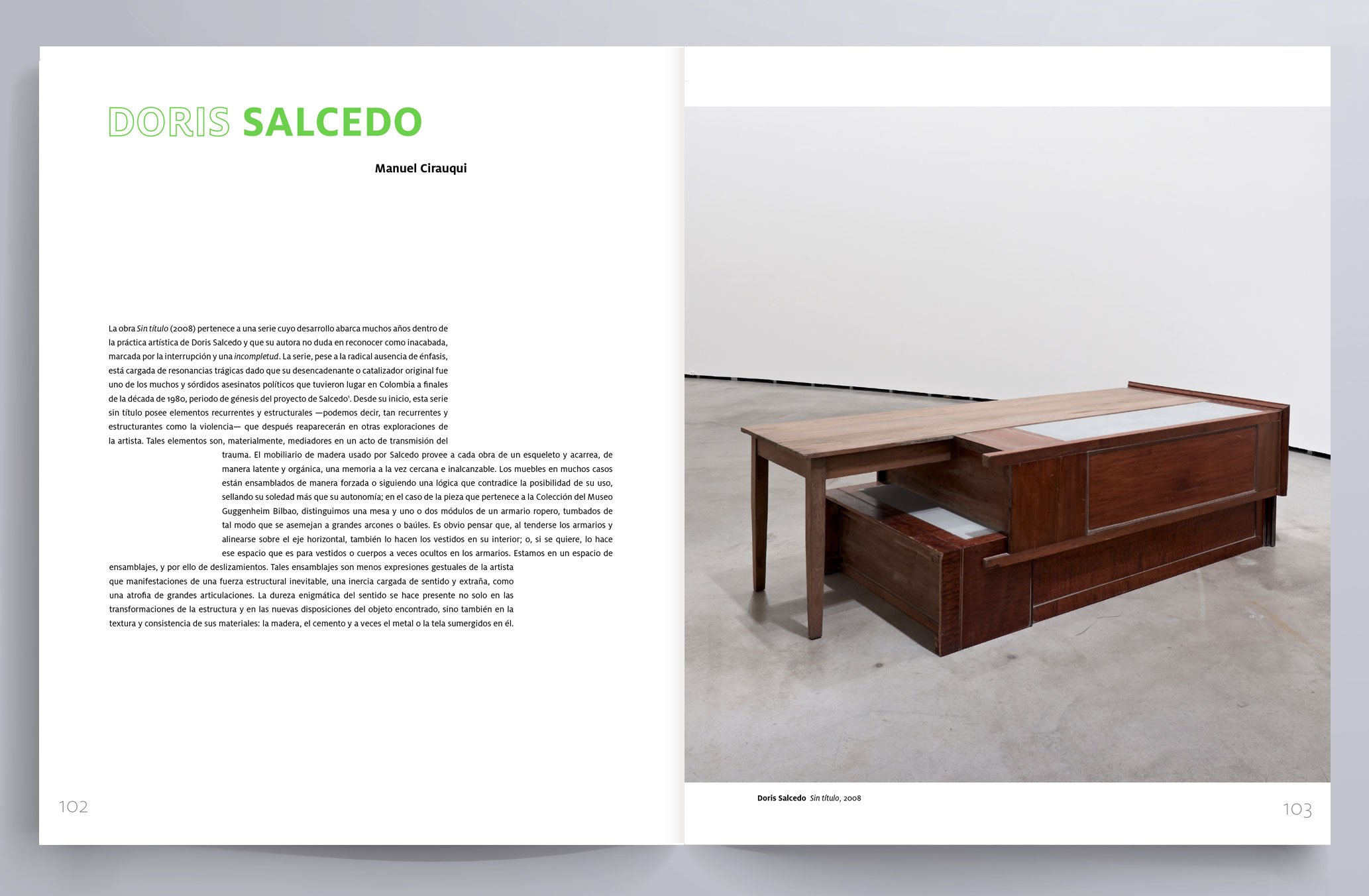
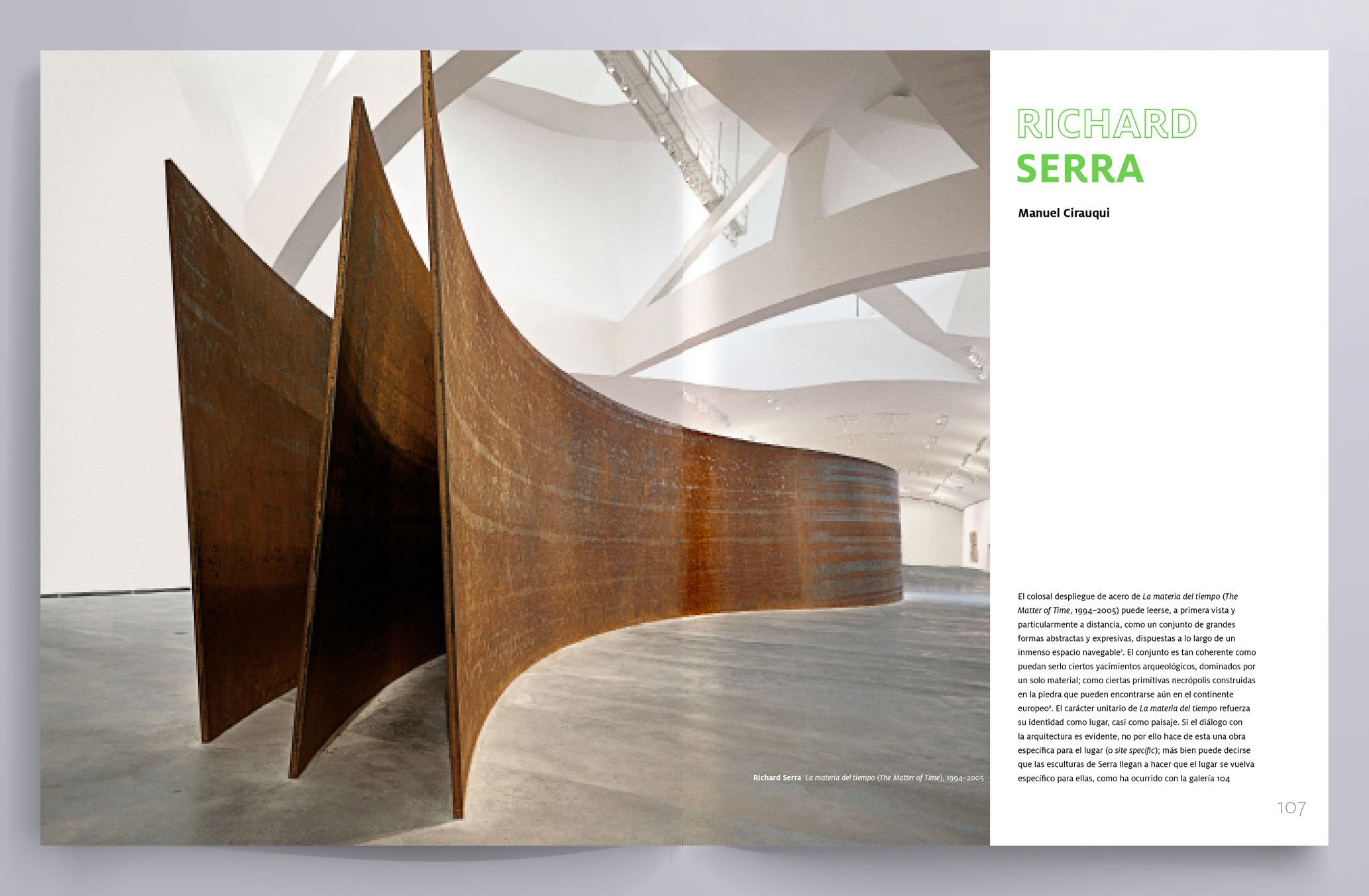
Wilcox Design had the great opportunity to design MISC. Apuntes de la Colección del Museo Guggenheim Bilbao for the Guggenheim Museum Bilbao in celebration of their 25th anniversary. The catalog highlights 25 stellar works within the museum collection and pairs them with texts by museum curators, written as a series of miscellaneous notes and perspectives about each artwork.
The holographic coating on the cover is an energetic translation of silver—the traditional material used to celebrate a 25th anniversary. The hologram adds dimension and depth to the books’ appearance— it is reflective, abstract, colorful and transforming.
The books’ interior design uses a bright, fluorescent green for the divider pages and artist names. The fluidity of the interior layout allows the text columns to be in a visual dialog with the artwork.
We thank the Museum’s Publications Department for their expert skill in overseeing this project and to Brizzolis for the beautiful printing and binding. The exhibition will be at open through January 22, 2023.
Hear Me Now Book Design
We had the great opportunity to design the book Hear Me Now for The Metropolitan Museum of Art, curated by Adrienne Spinozzi. This is the first museum exhibition in the Northeast to explore the work of enslaved potters who worked in the potteries operating in the Old Edgefield, South Carolina area in the 19th century. The show will be at the Met through February 10, 2023, then travel to the MFA Boston, the University of Michigan Museum of Art, and the High Museum of Art. We thank book production experts Peter Antony and Christina Grillo and editor Briana Parker for their superb work. It was printed beautifully by Ofset Yapımevi.
The clear PVC jacket design allows the title typography to appear with—but not obscure—the incised verse on this monumental storage jar created by David Drake, a literate African American potter.
Read Roberta Smith’s review in the The New York Times.
A Brochure That Goes to Your Head / Un Folleto Wue Se Te Va a la Cabeza
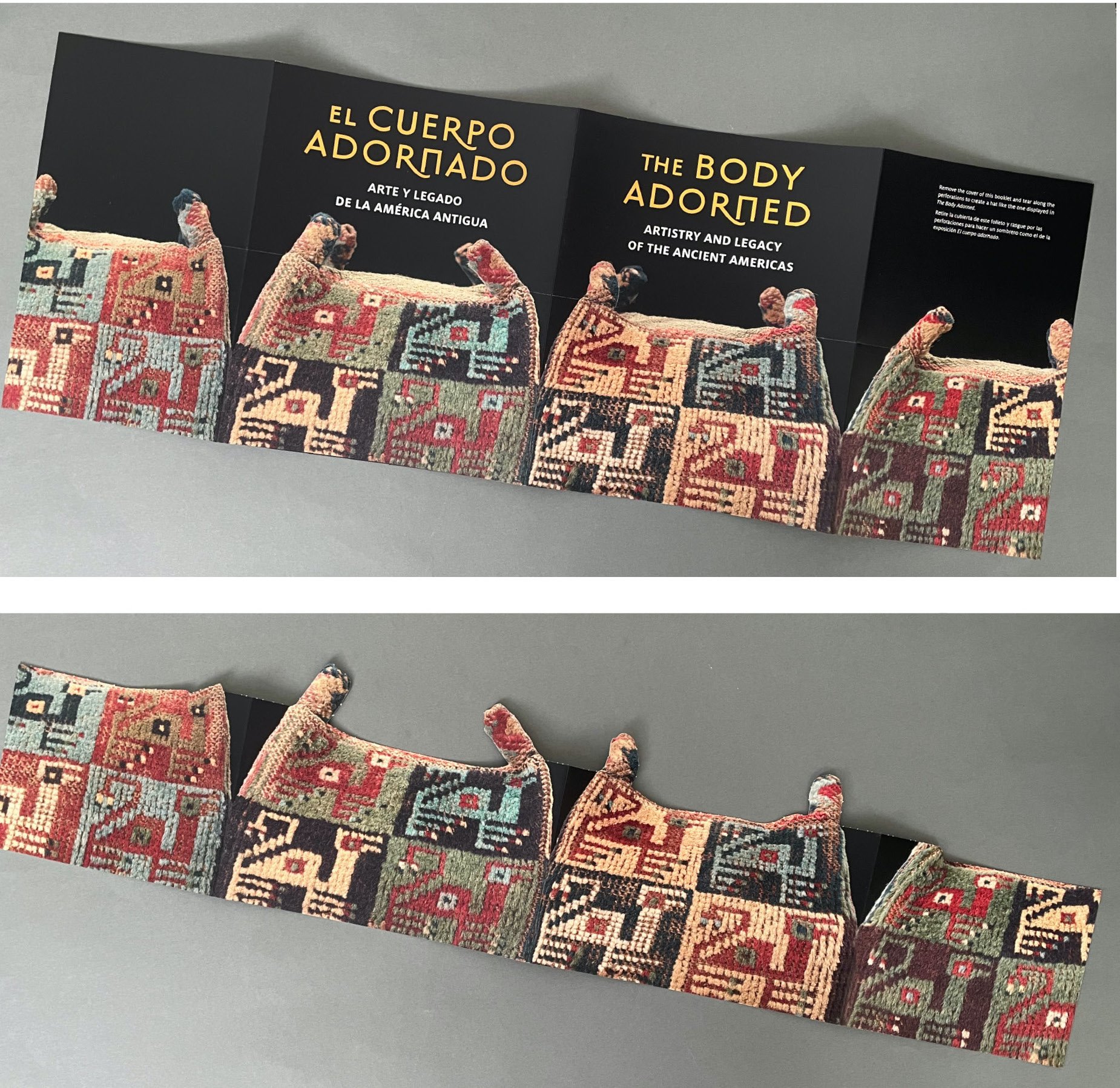
Many of the visitors coming to the Springfield Museums have a hat on their minds. After all, there’s a famous hat-wearing cat at the Dr. Seuss Museum. This winter they discovered a new hat in town in The Body Adorned: Artistry and Legacy of the Ancient Americas, at another of the Springfield Museums, The D’Amour Museum of Fine Art—and came away with a hat they could wear themselves.
From December 4, 2021 through February 27, 2022, The Body Adorned has explored treasures the ancient peoples of Colombia, Costa Rica, Panama, Peru, and Mexico created to wear—as well as the influence that their metalwork, textile, and ceramic traditions have had on generations of artists up until today.
Among the treasures featured in The Body Adorned is a fine example of a four-sided Wari hat, circa 900 AD, made up of four rectangular sides, each depicting a composite bird-camelid figure. The Wari hat was so precious to the Wari, who dominated the south-central highlands and the west coastal regions of Peru from 500–1000 AD, that it often was given a place of prominence in the owner’s grave.
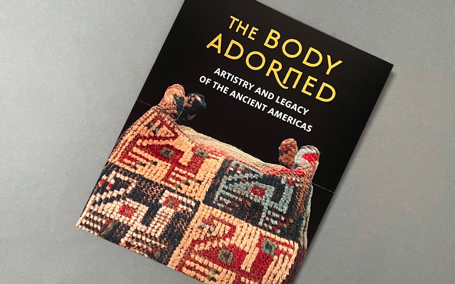
Wilcox Design developed the exhibition’s companion brochure specifically to interactively engage with the visitors of the Museum.
The brochure’s jacket cover can be removed and folded into a Wari hat. The jacket displays all four sides of the Wari hat on exhibition, with a perforation scored along the outline of the hat’s crown. Once torn along the scoring, the crown can be assembled using 3 adjustable tabs.
Here is the full brochure with the front and back flaps, before and after removing the perforated top portion.
The bilingual brochure is printed in English and Spanish. We alternate languages for the exhibition title when it appears on the cover—it is in English on the cover of the jacket, and in Spanish on the cover of the brochure.
To learn more: The Body Adorned: Artistry and Legacy of the Ancient Americas
Top photo: Maggie North, Curator of Art, Springfield Museums in the Wari hat. Photo care of the Springfield Museums, Springfield, MA
A look back at our favorite projects of 2021
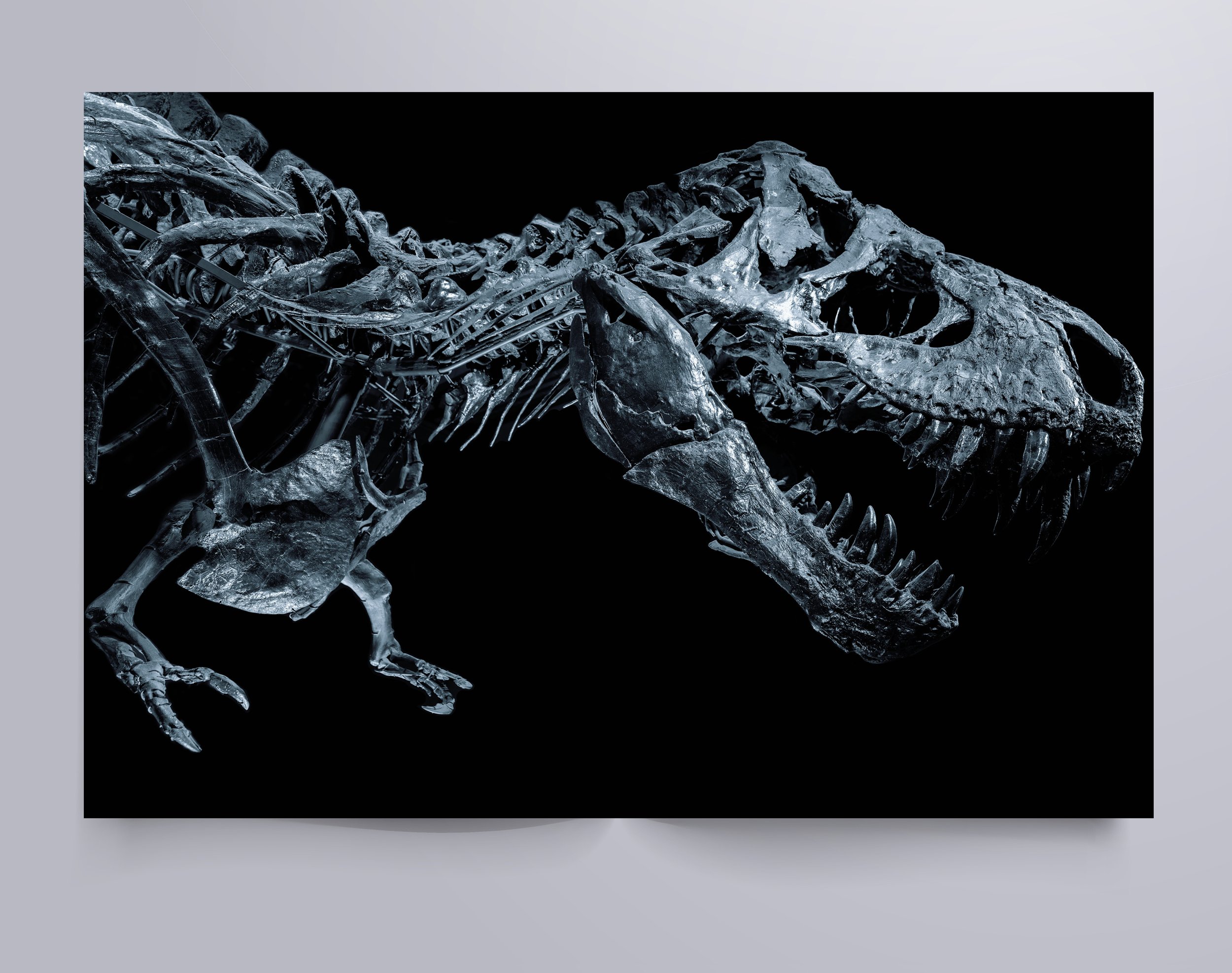
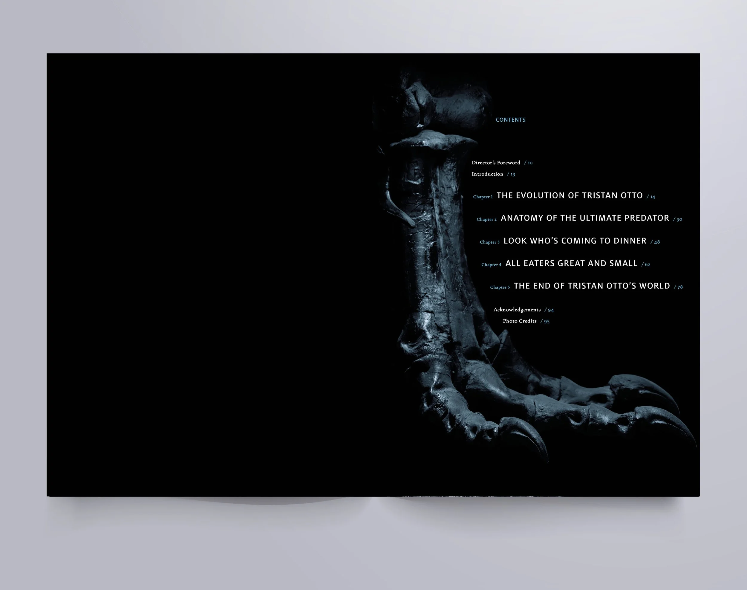
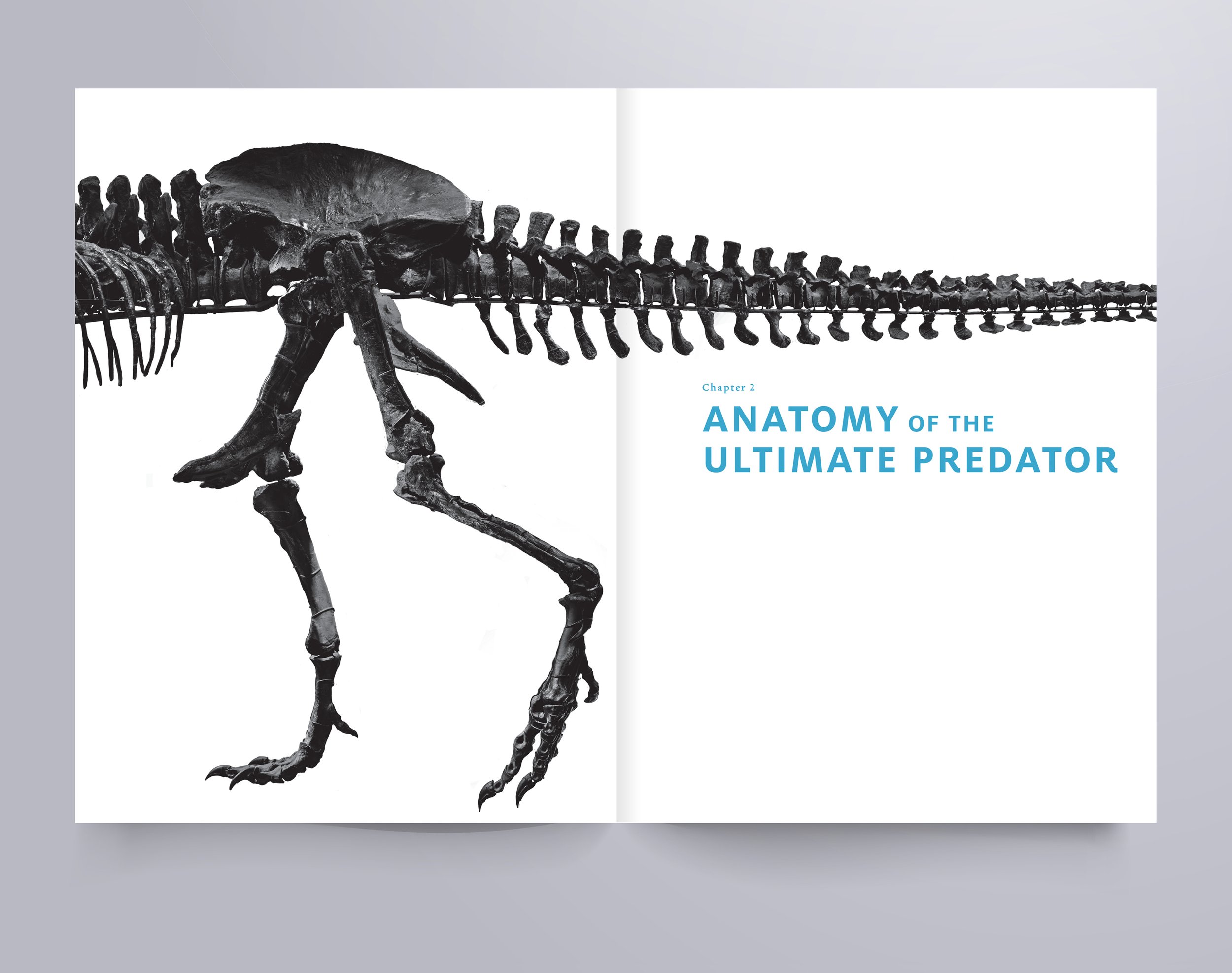
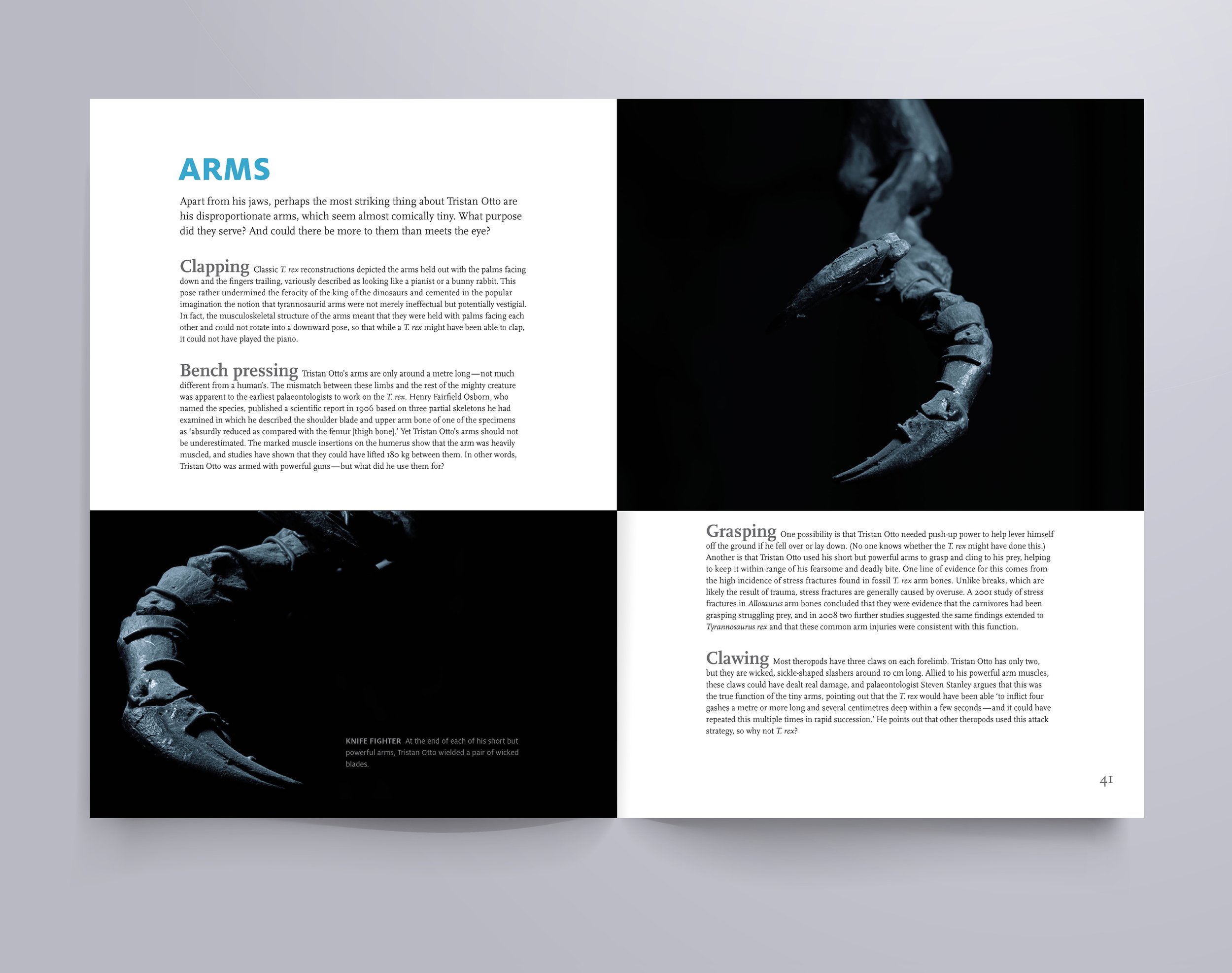
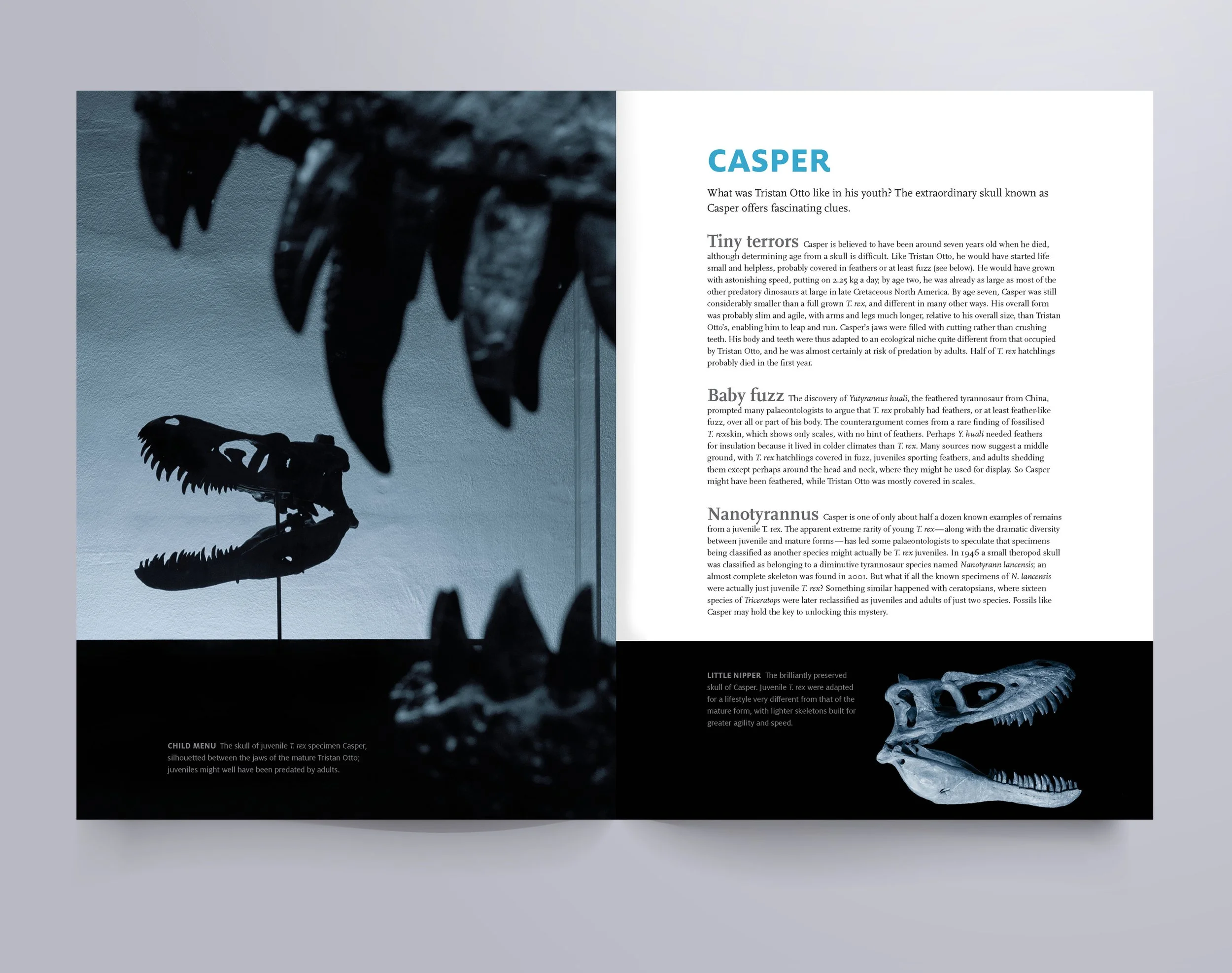
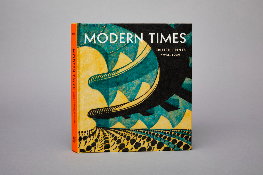
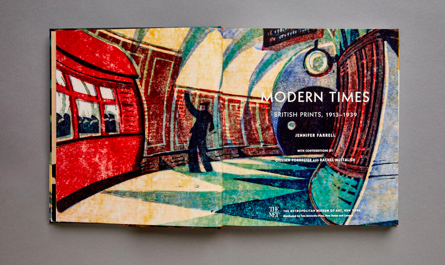
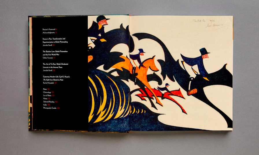
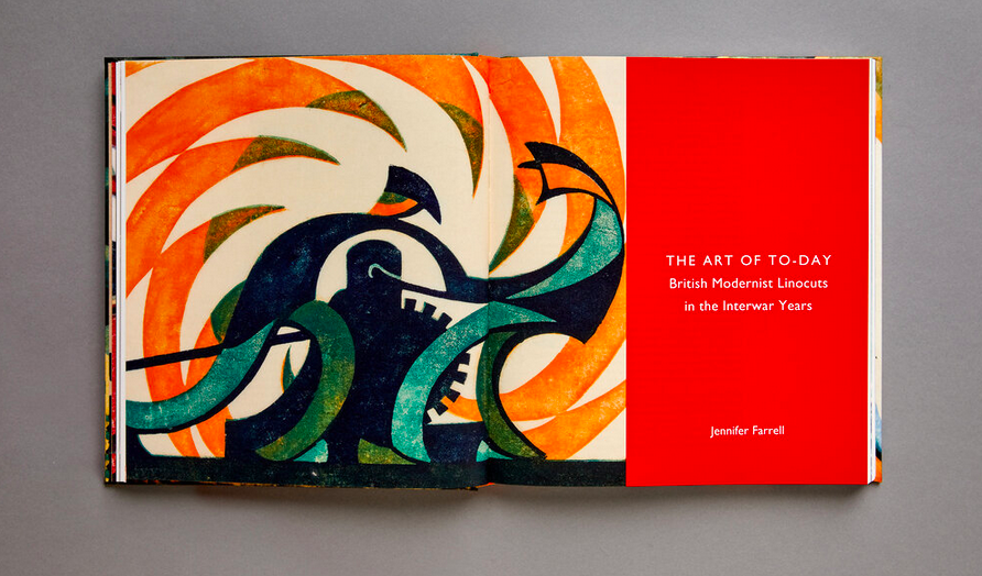
A few of our projects this year enabled us to do a little time traveling. First, back to the prehistoric, designing a catalog for the Natural History Museum of Denmark about the T. Rex named Tristan Otto. Then we crowned ourselves with a 700 AD Wari hat for The Springfield Museums exhibition The Body Adorned. For our summer adventure, we crossed the pond for the beautiful work of British printmakers from World War I to World War II for the Met Museum’s Modern Times catalog.
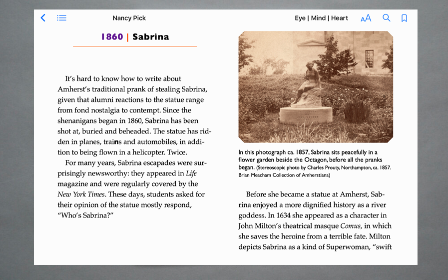
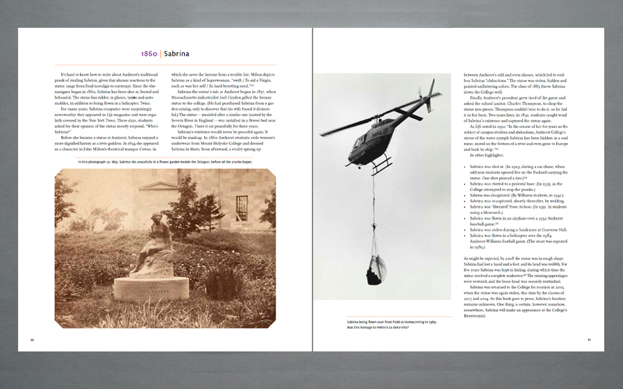
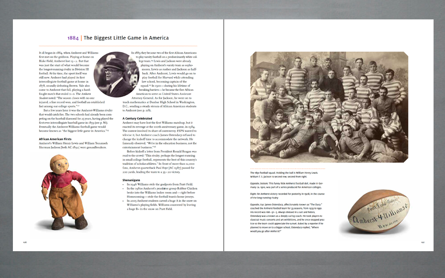
It was also a year of first opportunities—as a co-curator on the On Solitude exhibition for the Princeton School of Architecture—and producing an e-pub for Amherst College on their bicentennial book, Eye | Mind | Heart. We wrapped up the year with a “hands on” approach for the Thinking with Things identity, symbolizing how our thoughts and our hands can bring active learning with physical materials into any teaching practice.
The Body Adorned brochure jacket is perforated to create a wearable Wari hat.
4 pages from the Eye | Mind | Heart e-pub with the printed book spreads for comparison below
Brochure cover for the Bowdoin College Museum of Art; book cover for Forsesi Press
On Solitude: A catalog design guides the exhibition construct
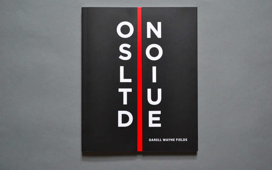
Earlier this year I had the exceptional opportunity to collaborate with distinguished designer and scholar of race and architecture Darell Fields on a unique project in which the design of the exhibition catalog provided the guiding principles for the installation design for his exhibition, On Solitude at the School of Architecture at Princeton University. The images below provide a perspective on ways that the catalog design was informed by the architect’s work, and how the design of the book translated into the exhibition design. My engagement included collaborating with Fields on curatorial design, developing exhibition design and graphics, and designing the exhibition catalog.
As described by the School of Architecture, “On Solitude is a parallel and contemporaneous anthology shadowing Darell Fields’ theoretical treatise, Architecture in Black. These visual artifacts depict the interplay of different sign systems including Black language traditions, visual formalisms, and architecture. The exhibition includes pivotal works fulfilling the promise of Black architecture theory since 2000.”
The exhibition opened in spring 2021 and can be viewed online through the project web page.
VEIL / SHADOWS / SHROUD
In the book’s introduction, Fields quotes W.E.B. Du Bois, from The Souls of Black Folk: “I remember well when the shadow swept across me... and I was shut out from their world by a vast veil.”
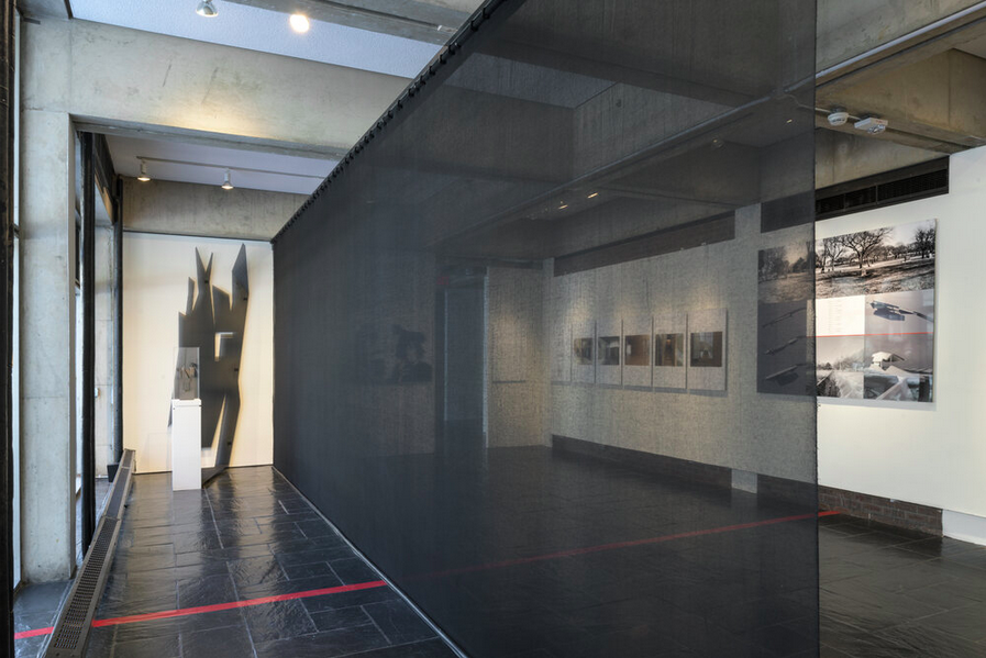
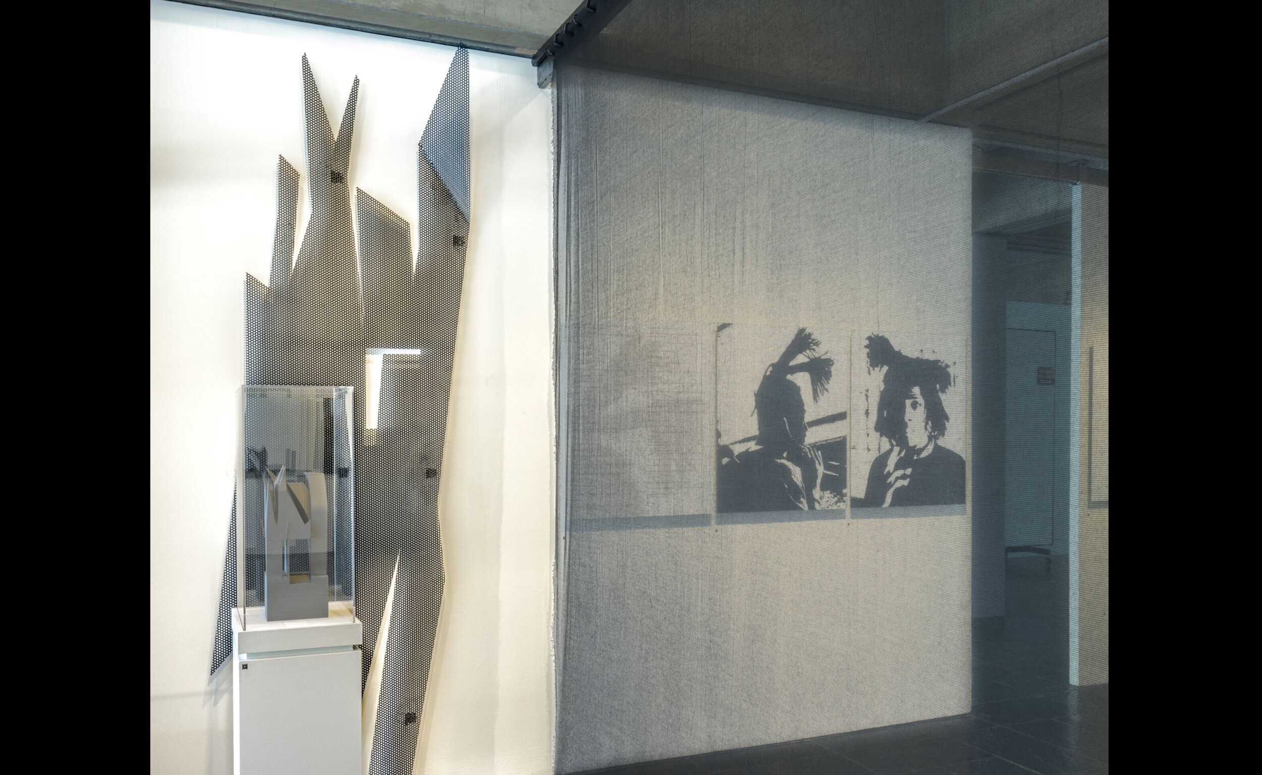
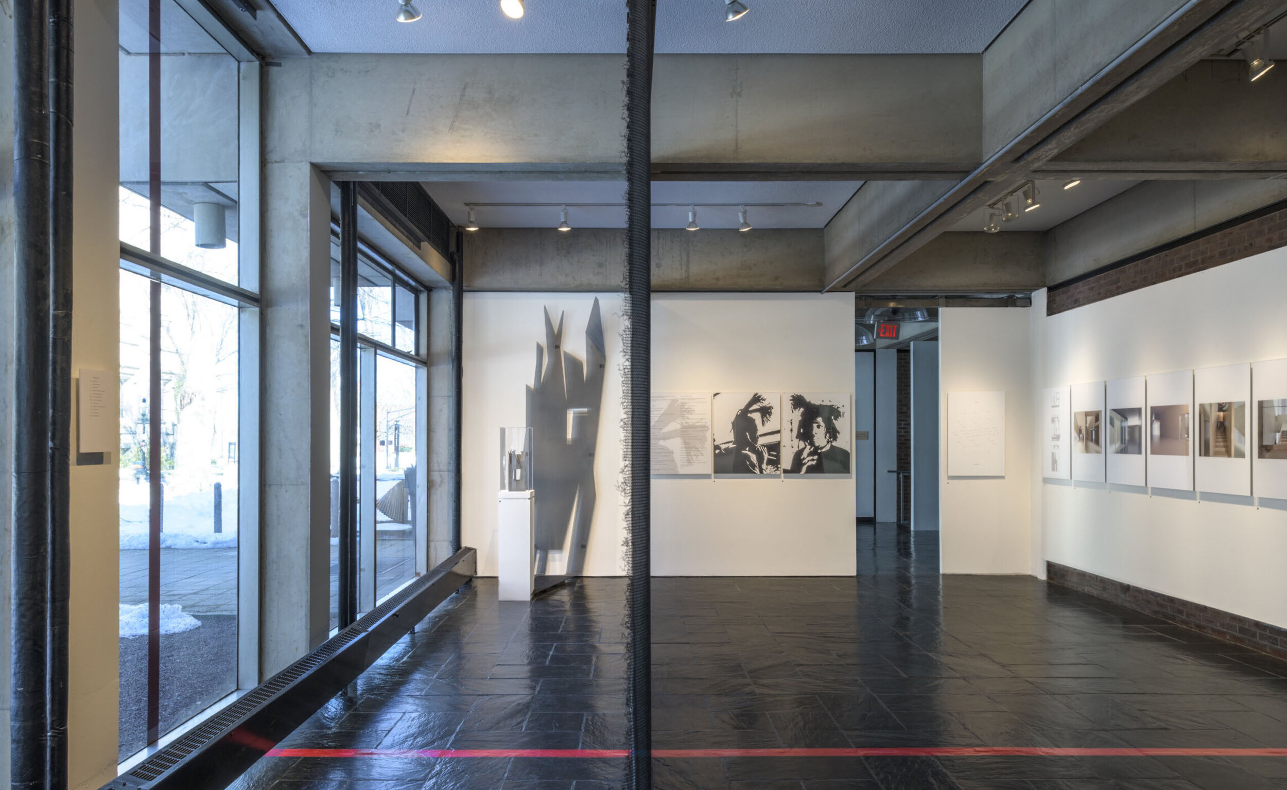
In Fields architectural renderings, shadows and veils appear in the form of animated shapes and silhouettes. In the exhibition the physical manifestation of the shadow is rendered in perforated metal and the veil is represented as a mesh screen.
In the exhibition, the shadows and veils intersect. An imposing cast shadow, constructed of perforated metal behind the model, is juxtaposed against the unraveling veil of the mesh scrim that divides the gallery space.
In Field’s architectural renderings the hard-edged shadows cast spirited silhouettes.
Some of these silhouettes inspire forms that appear both in the book and in the exhibition design.
On the gallery windows this hair silhouette is recreated as a perforated pattern.
The exhibition features one of Fields’ built projects, The Lyllye Reynolds-Parker Black Cultural Center in Eugene, OR, where a perforated screen shields the common meeting area when it is not in use.
COVER DESIGN
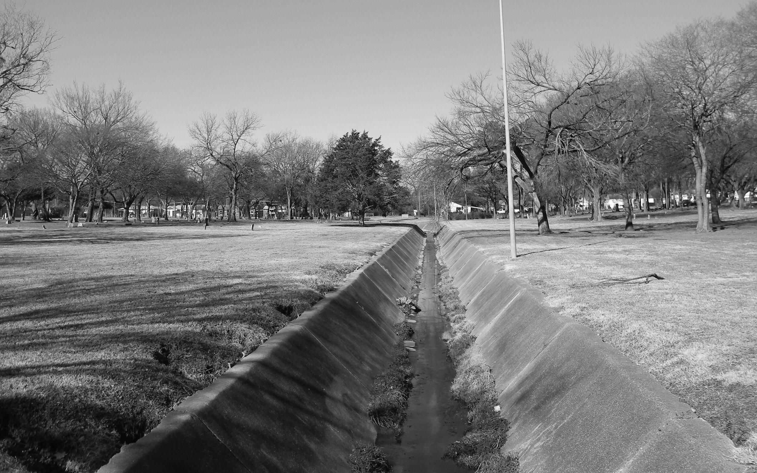
The catalog cover design is an interpretation of Fields’ Black Architecture Project. This project examines the mystery behind the conspicuous placement of a culvert in a Black cemetery.
“Someone decided to place a culvert through the heart of a black cemetery. Or, someone decided a black cemetery should be placed on either side of a culvert.” –Darell Fields.
This disruption of a sacred space, and the ambiguous history of this design decision, is thoughtfully transformed by this protective shroud that Fields constructs over the culvert.
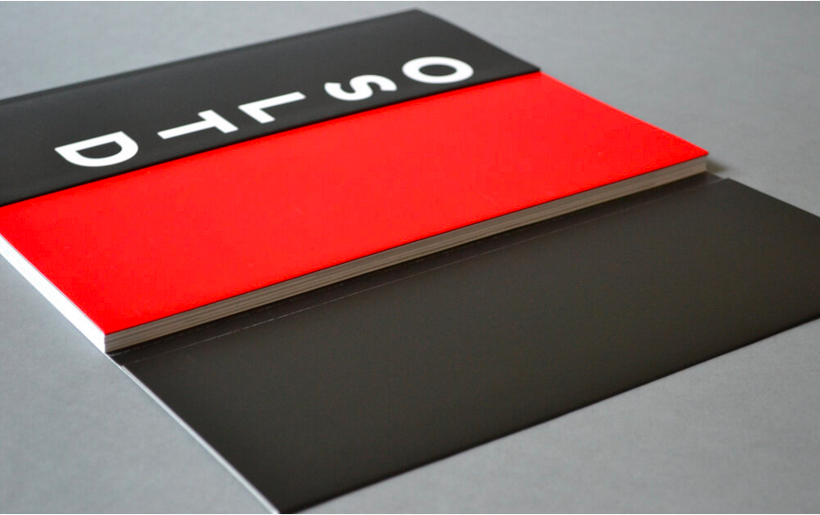
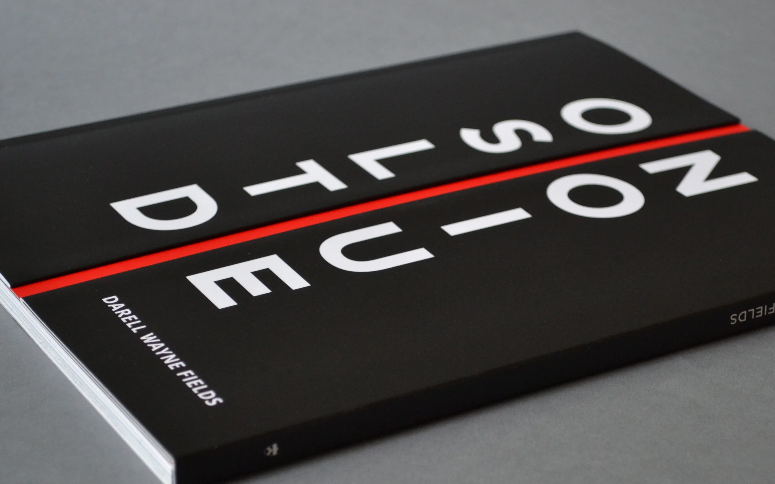
The metaphor of this culvert inspired the cover design for the exhibition catalog, in which an intentional space physically splits both the book and its title in half.
The cover is constructed with an overlaid half-panel that wraps over the spine and onto the back. The back cover has a second spine and half flap that wraps onto the front of the book.
These 2 halves align, falling just short of the center, creating a recessed gap.
Magnets affixed within the cover folds maintain precise alignment of the side-by-side cover and keep the right panel lying flat against the book.
The unconventional entry into the book gives the reader pause and reinforces the metaphor. The reader must grasp the inner edge of the right panel, and is met with some resistance when opening the book.
The use of magnets started out as a design solution to assure that the right flap would lie flat when the book was opened, but this inherent property of resistance also meant that the magnets themselves would serve as a protective shroud for the works featured in the catalog.
GALLERY ENTRY
The gallery entry door replicates the book cover design. As visitors enter the gallery through the center, the right panel slides open on barn door hinges.
A red line on the gallery floor aligns with the photo of the culvert. This line intersects with the mesh scrim that splits the gallery space in half.
Thus, the exhibition design is informed by the intersection of veil, shadow, and shroud to perforation, mesh, and screen.
Here is a look back at our favorite projects from 2020
Yale University Press Going There by Richard J. Powell
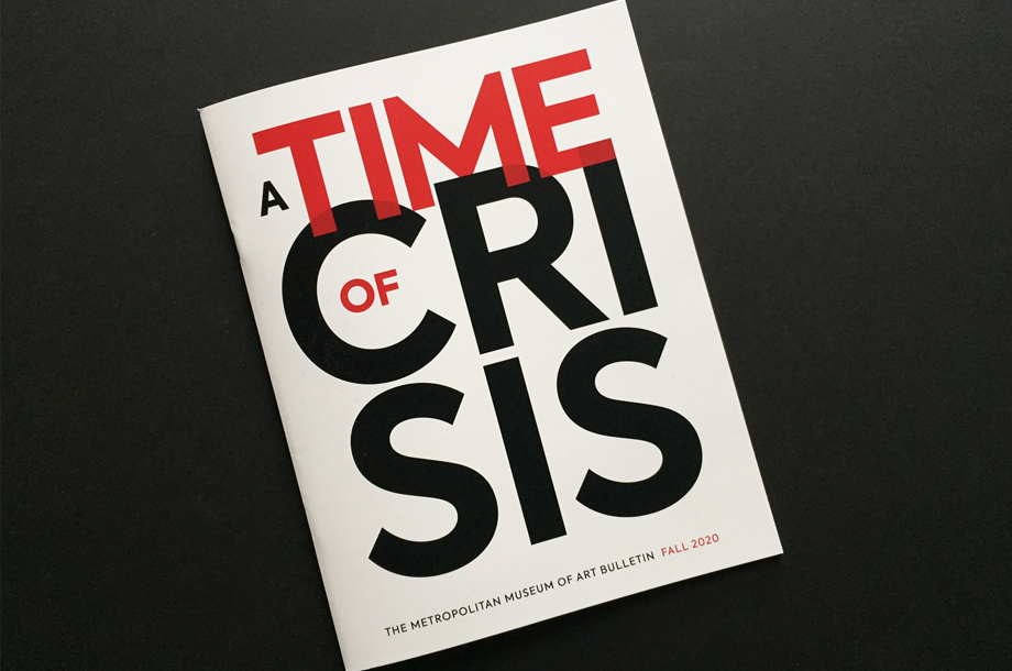
The Metropolitan Museum of Art Fall 2020 Bulletin, A Time of Crisis
Harvard Business School South Sea Bubble, 1720 website
Amherst College Eye | Mind | Heart Bicentennial book
Mount Holyoke College Art Museum Annual Stewardship Report
Lee Cott Structured in a New Light
Provincetown Art Association and Museum Alvin Ross: A Centennial Celebration exhibition catalog and online exhibition
Cover of the MET Bulletin, Fall 2020
A Time of Crisis
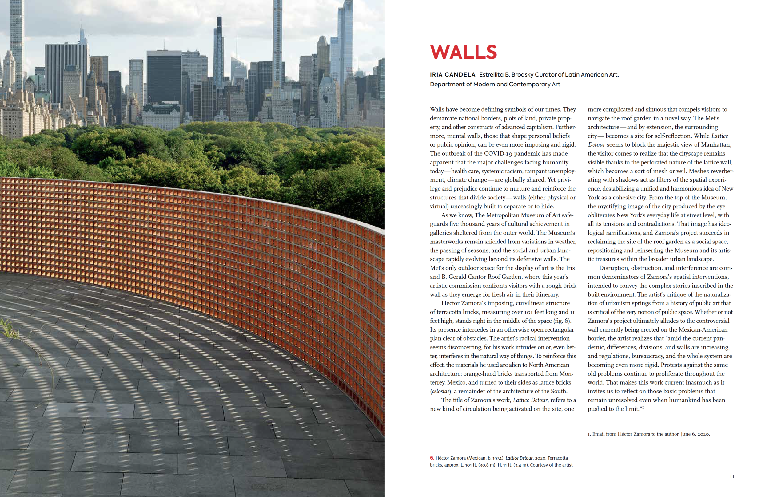
We are thrilled and honored to have just completed A Time of Crisis, a special issue of the Bulletin for the Metropolitan Museum of Art.
This issue reflects on some of the crises gripping our world in the present moment, including the catastrophic impact of a pandemic and the continuing tragedy of racial injustice.
The stark palette of the cover—black, white and red—sets a powerful tone, where the typography and the use of scale expresses the themes of disruption and urgency.
#METMUSEUM
https://www.metmuseum.org/art/metpublications/A_Time_of_Crisis
We just launched BACKTALK, an online exhibition featuring diverse artists speaking back to racial and cultural stereotypes. →
We are proud to go live with the online exhibition website Backtalk: Artists on Native, African, and African American Stereotypes for the Smithsonian Museum of African Art. Backtalk focuses on a diverse group of artists from various backgrounds, geographies, and contexts who have addressed intersecting themes and subjects relevant to the impact of cultural and racial stereotypes. Backtalk features works by nine 20th- and 21st-century artists who capture, reflect, and/or speak back to the stereotype.
These artists challenge historical assumptions and destabilize Western power dynamics by unveiling the profound influence of colonization and racism on the writing of history. All of the works in Backtalk speak from the perspective of the “Other,” and invite us to rethink the impact of institutionalized racism and sexism on issues of individual identity, authenticity, and the history of representation.
Here's a look back at our team's favorite projects from 2019—books / branding / websites
Peggy Guggenheim Collection / Peggy Guggenheim: The Last Dogaressa
Harvard Business School / Photography and Corporate Public Relations, The Case of U.S. Steel / Catalog
Striking Steel
We just completed the exhibition catalog and website on Photography and Corporate Public Relations, The Case of U.S. Steel for the Baker Library at the Harvard Business School. US Steel website
From 1930 to 1960, the United States Steel Corporation commissioned photographers around the country to document the inner workings of the company and its subsidiaries as part of a national public relations campaign. Striking pictures of steel workers, blast furnaces, and company plants appeared in national magazines, company publications, and exhibitions that reached large audiences. This stunning body of images included the work of noted artists, photographers from the corporation’s engineering corps, and local studios near company plants. In the current age of converging public relations, marketing, and social media, the United States Steel Corporation Photographs collection at Baker Library provides a window into the corporation’s innovative use of photography and the emerging field of PR to galvanize public opinion.
–From the introduction by Melissa Banta, Curator
CATALOG SPREADS
The online exhibition was a collaboration with Wilcox Design, Green Interactive, and the Information Products and Technical Services, Baker Library. U.S. Steel Website
Cool Roofs: A Community Mural Arts Project with a Green Twist Takes Flight
If the flap of a butterfly’s wings can be instrumental in generating a tornado, it can equally well be instrumental in preventing a tornado.
—Edward N. Lorenz, meteorology professor at MIT, formulated the term Butterfly Effect in 1972
This week I will be part of a group exhibition at the Cambridge Arts Gallery called Untold Possibilities. The show focuses our attention on climate disruption and its implications for nature and society.
This is my first time as an exhibiting artist, I have always been on the other side of exhibitions—working with curators and collaborating with artists as I design the exhibition catalogs and brochures. My project is called Cool Roofs.
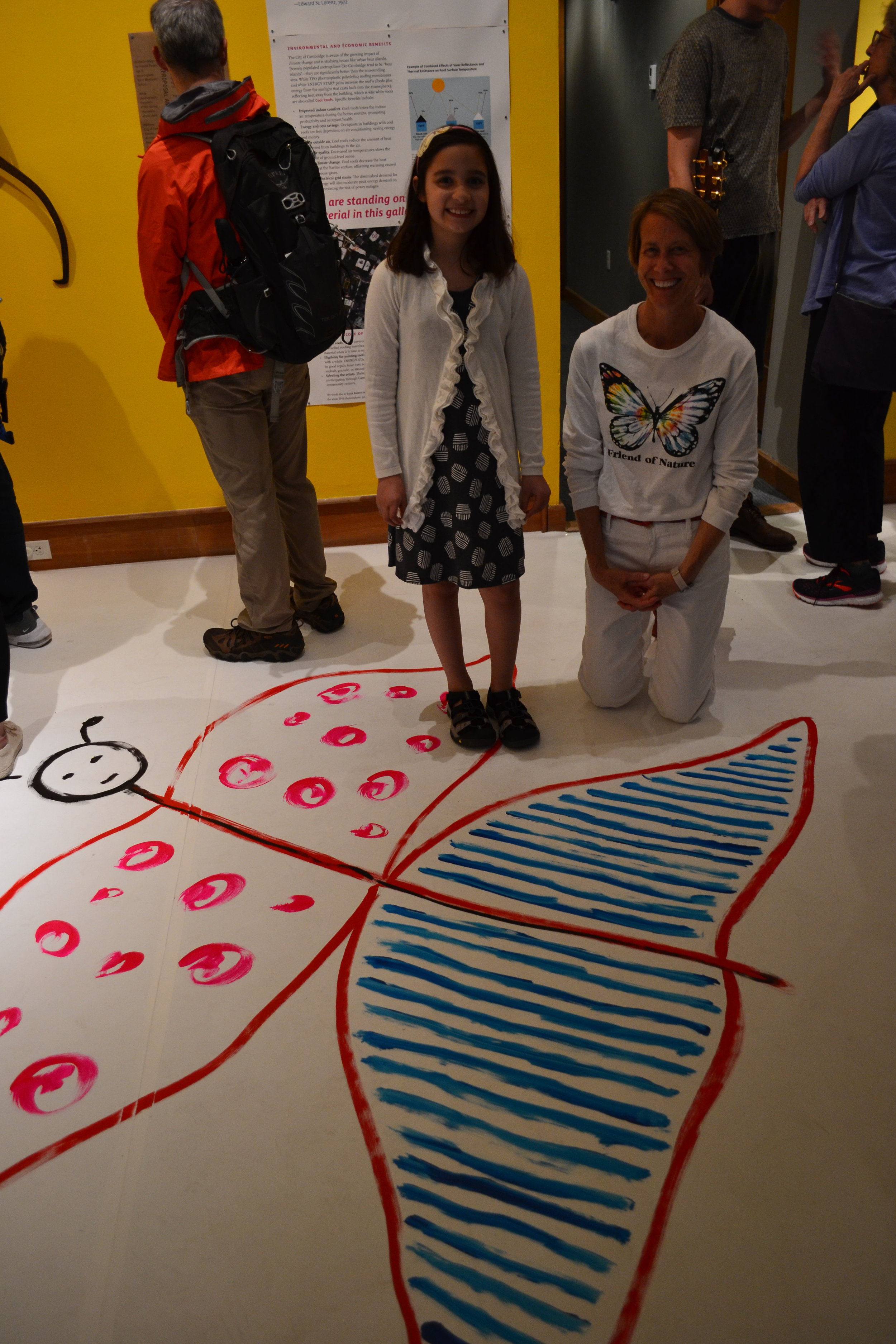
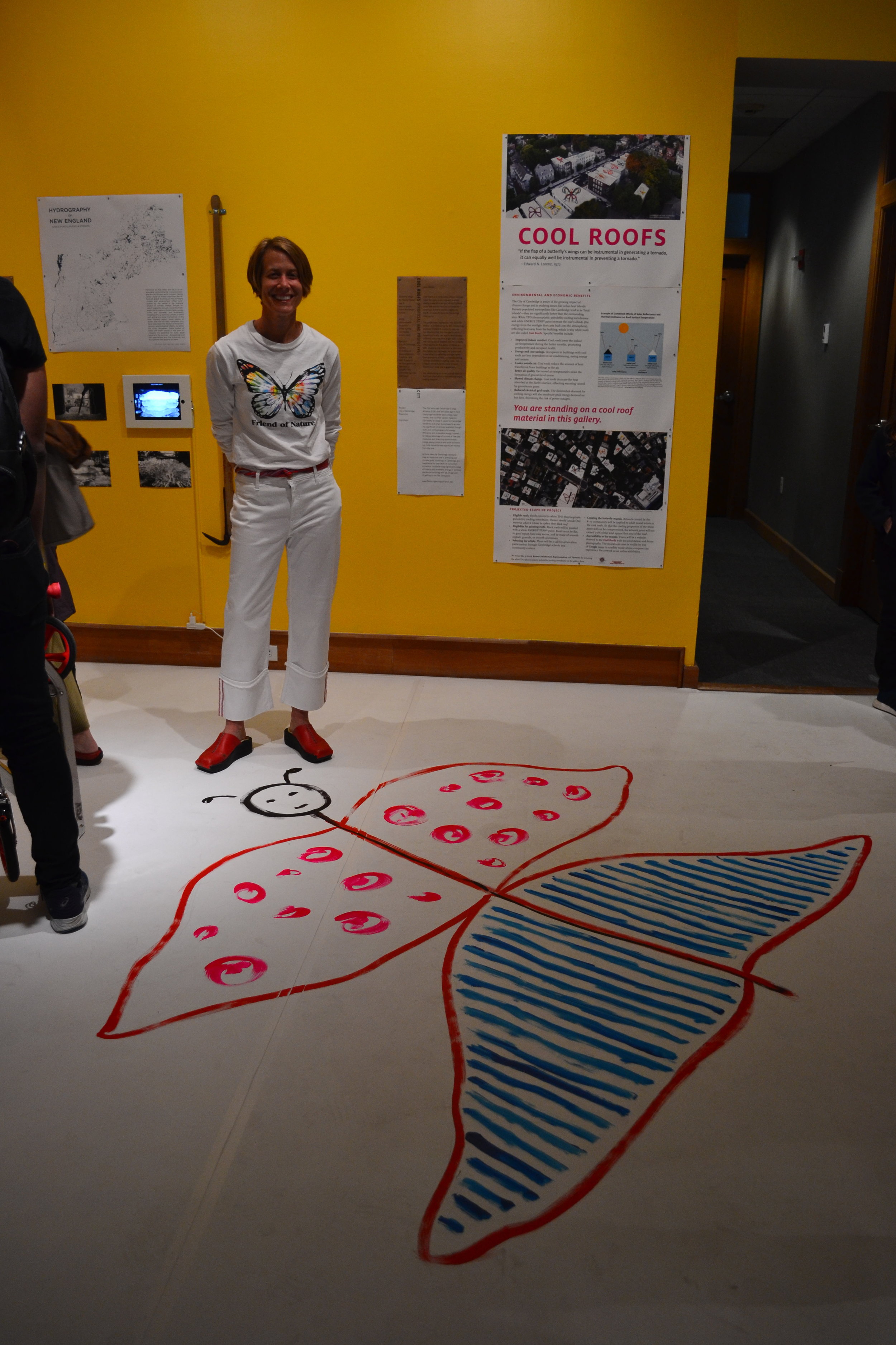
Meet Helene, the artist behind the butterfly drawing. Who said fighting climate change can’t be beautiful?!
Cool Roofs is a remarkably simple concept: cover flat roofs in our city with a white roofing material or white ENERGY STAR® paint and use the roofs as canvases for enormous butterfly murals created by the K-12 students from the Cambridge community. The project was inspired by “the butterfly effect,” a phrase coined by MIT meteorology professor Edward N. Lorenz to describe his discovery that tiny changes in initial conditions can lead to dramatically different outcome on a larger scale. Lorenz was talking about weather, but the butterfly effect applies to this public initiative as well. The small act of changing the color of our roofs from black to white decreases the urban heat island effect by lowering temperatures through the reflection of sunlight.
Keith Oleson of the National Center for Atmospheric Research in Boulder, Colorado (1) states that if every roof in large cities around the world were white it would decrease the urban heat island effect by 33%. I was struck by the simplicity of this solution.
As a graphic designer my task is to communicate ideas and concepts in a clear and concise way. Looking at the theory of the Butterfly Effect as a model for climate change, I envisioned the white roofs as blank canvases for artwork. The butterfly is a symbol of endurance, change, hope, life, and transformation because of its impressive process of metamorphosis. This cool roofs project extends the community-building initiatives of the mural arts movement in Cambridge with a green twist, creating cool art for a hot climate.
To learn more, go to:
untoldpossibilities.org/coolroofs
Creation and Installation
Firestone donated 700 square feet of white energy star roofing material so that we could cover the entire gallery space with it. The installation went smoothly, laying flat to the floor with no air pockets or ripples.
Exhibition graphics are mounted to the wall.
The gallery’s four walls are a gradation of light to dark blue, then dark to light yellow.
Helene, a second-grade student at the Tobin Montessori School created the butterfly artwork.
I recreated the butterfly onto the gallery floor with acrylic paints, this butterfly went from a crayon sketch on 8.5 x 11” paper to over six feet wide.
By way of satellite and Google Maps the butterfly artwork can be viewed as an online exhibition.
Note
(1) “Effects of white roofs on urban temperature in a global climate model” by Keith Oleson of the National Center for Atmospheric Research in Boulder, Colorado.
Launching the New Brand for Fitchburg Art Museum

The new brand identity forefronts the FAM acronym with a typographic design that reflects the museum’s culture of openness—everyone is welcome in the FAMily—while boldly asserting its mission to bring groundbreaking, high-quality art offerings to the community.
Read MoreHere's a look back at our team's favorite projects from 2018.
MIT Press / Design Unbound, Vol. 1 and 2
American Federation of Arts / Victorian Radicals
Mount Holyoke College Art Museum / Calendar


