Earlier this year I had the exceptional opportunity to collaborate with distinguished designer and scholar of race and architecture Darell Fields on a unique project in which the design of the exhibition catalog provided the guiding principles for the installation design for his exhibition, On Solitude at the School of Architecture at Princeton University. The images below provide a perspective on ways that the catalog design was informed by the architect’s work, and how the design of the book translated into the exhibition design. My engagement included collaborating with Fields on curatorial design, developing exhibition design and graphics, and designing the exhibition catalog.
As described by the School of Architecture, “On Solitude is a parallel and contemporaneous anthology shadowing Darell Fields’ theoretical treatise, Architecture in Black. These visual artifacts depict the interplay of different sign systems including Black language traditions, visual formalisms, and architecture. The exhibition includes pivotal works fulfilling the promise of Black architecture theory since 2000.”
The exhibition opened in spring 2021 and can be viewed online through the project web page.
VEIL / SHADOWS / SHROUD
In the book’s introduction, Fields quotes W.E.B. Du Bois, from The Souls of Black Folk: “I remember well when the shadow swept across me... and I was shut out from their world by a vast veil.”
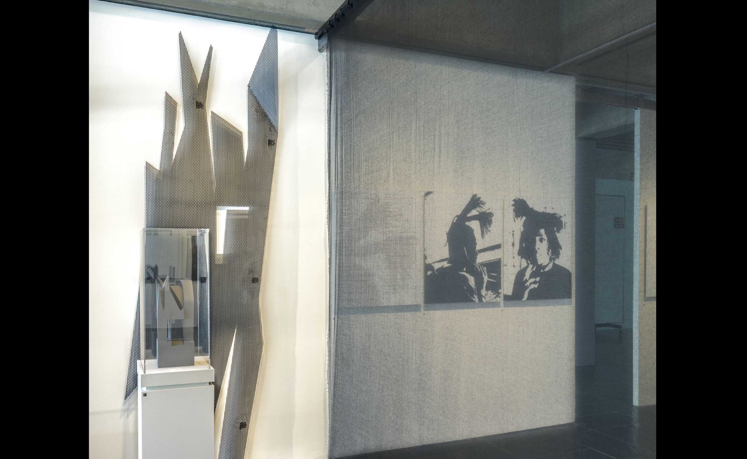
In Fields architectural renderings, shadows and veils appear in the form of animated shapes and silhouettes. In the exhibition the physical manifestation of the shadow is rendered in perforated metal and the veil is represented as a mesh screen.
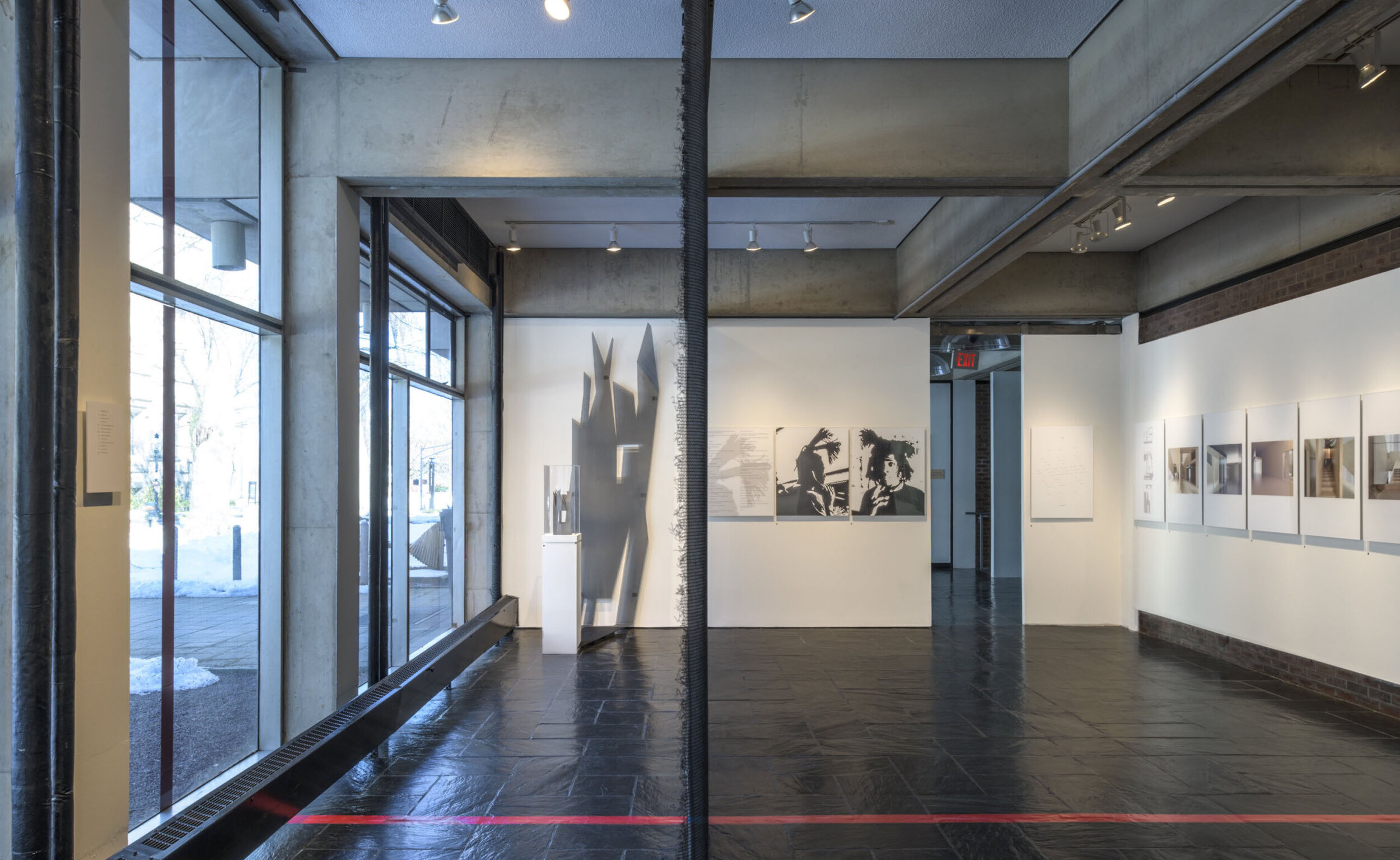
In the exhibition, the shadows and veils intersect. An imposing cast shadow, constructed of perforated metal behind the model, is juxtaposed against the unraveling veil of the mesh scrim that divides the gallery space.
In Field’s architectural renderings the hard-edged shadows cast spirited silhouettes.
Some of these silhouettes inspire forms that appear both in the book and in the exhibition design.
On the gallery windows this hair silhouette is recreated as a perforated pattern.
The exhibition features one of Fields’ built projects, The Lyllye Reynolds-Parker Black Cultural Center in Eugene, OR, where a perforated screen shields the common meeting area when it is not in use.
COVER DESIGN
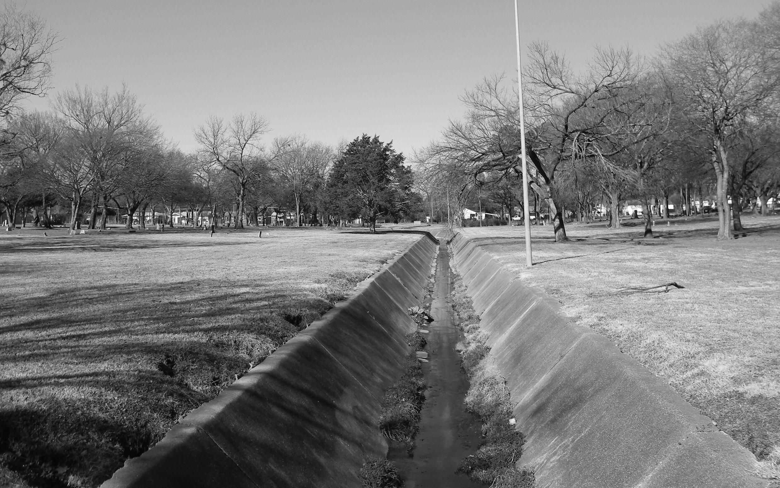
The catalog cover design is an interpretation of Fields’ Black Architecture Project. This project examines the mystery behind the conspicuous placement of a culvert in a Black cemetery.
“Someone decided to place a culvert through the heart of a black cemetery. Or, someone decided a black cemetery should be placed on either side of a culvert.” –Darell Fields.
This disruption of a sacred space, and the ambiguous history of this design decision, is thoughtfully transformed by this protective shroud that Fields constructs over the culvert.
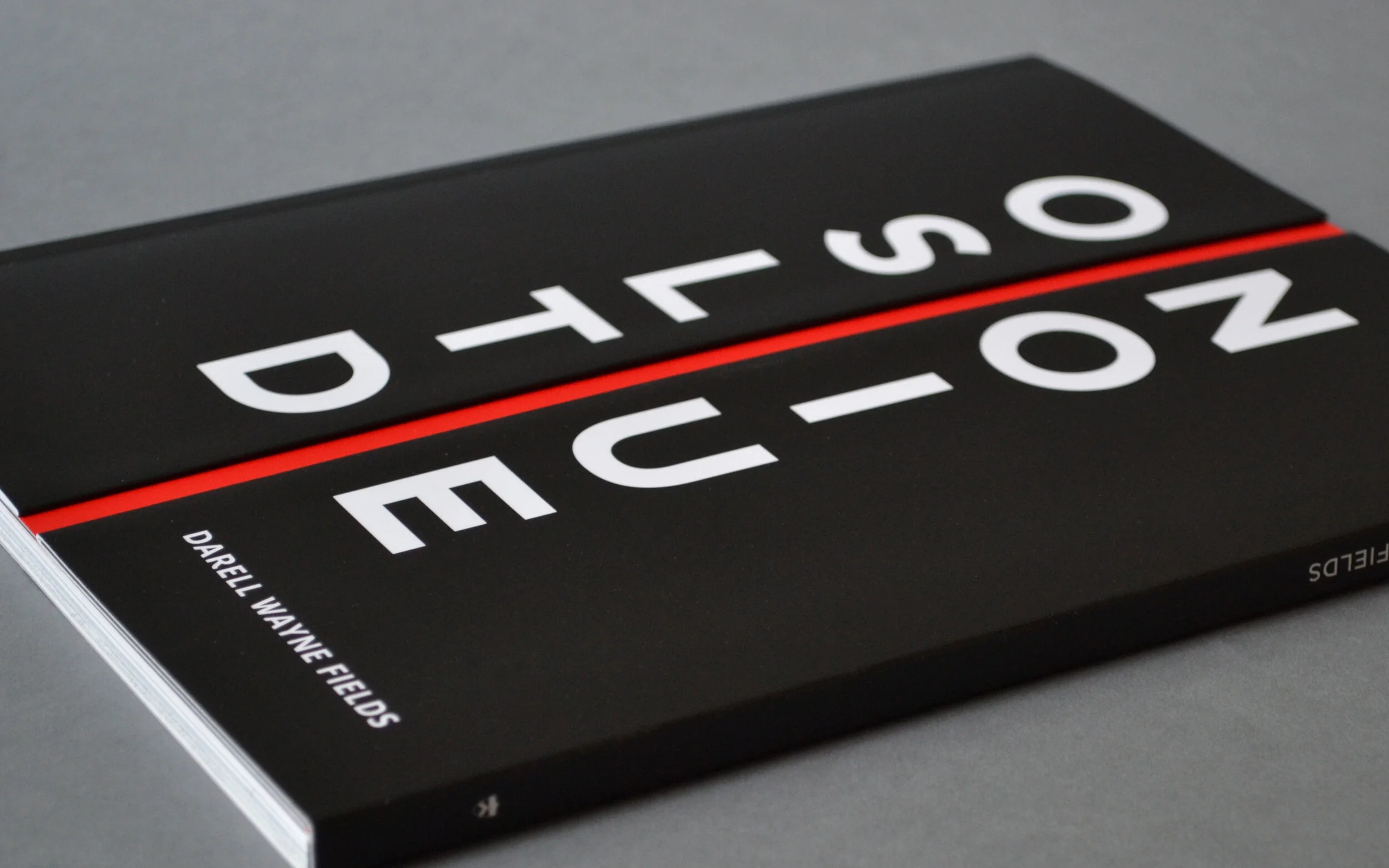
The metaphor of this culvert inspired the cover design for the exhibition catalog, in which an intentional space physically splits both the book and its title in half.
The cover is constructed with an overlaid half-panel that wraps over the spine and onto the back. The back cover has a second spine and half flap that wraps onto the front of the book.
These 2 halves align, falling just short of the center, creating a recessed gap.
Magnets affixed within the cover folds maintain precise alignment of the side-by-side cover and keep the right panel lying flat against the book.
The unconventional entry into the book gives the reader pause and reinforces the metaphor. The reader must grasp the inner edge of the right panel, and is met with some resistance when opening the book.
The use of magnets started out as a design solution to assure that the right flap would lie flat when the book was opened, but this inherent property of resistance also meant that the magnets themselves would serve as a protective shroud for the works featured in the catalog.
GALLERY ENTRY
The gallery entry door replicates the book cover design. As visitors enter the gallery through the center, the right panel slides open on barn door hinges.
A red line on the gallery floor aligns with the photo of the culvert. This line intersects with the mesh scrim that splits the gallery space in half.
Thus, the exhibition design is informed by the intersection of veil, shadow, and shroud to perforation, mesh, and screen.


